Friday 13 March 2015

Apple Pegged To Bring Force Touch Pressure-Sensitive Input To Next iPhones

 Apple’s Force Touch tech, which it built into both the new 12-inch MacBook and the new Apple Watch, is also headed to the next iPhone, according to a new report from the Wall Street Journal. Frankly, after trying the tech out in person, I’d be more surprised it wasn’t using Force Touch across all of its upcoming products. The pressure-sensitive input method allows for a deeper press to be detected as a secondary type of input vs. a standard one, which could open up a lot of options for a completely touch-based smartphone.
The Force Touch trackpad on the new MacBook (and the new 13-inch MacBook Pro with Retina Display) acts and feels like a normal, mechanical Mac trackpad, with a satisfying click when pressed, but in fact its motion is limited to around less than one nanometer of travel, supplanting the downward motion with a very fine side-to-side haptic motor agitation that is impossible to register as anything else than a press. This allows you to press once for a normal click, and then press a second, deeper time following the first to access a secondary function or perform some other action, without having to right-click or open a menu.
On an iPhone, you can see a lot of the potential benefits of using this kind of tech. It wold allow for new control capabilities for games, for instance, and could help make for much more sophisticated input response in apps like Garage Band, where being able to detect the difference between a light and a hard press could translate to different sounds produced by a virtual keyboard. Apple already kind of does this with Garage Band, but it’s a far less sensitive mechanism, which basically uses the iOS device’s motion sensor to register big differences in tap pressure.
Apple showed how Force Touch on new MacBook trackpads enables handwriting input with subtle pressure detection. That kind of input capability on an iPhone or iPad could also open up options for drawing, painting and other creative apps. There are now a number of Bluetooth stylus accessories that mimic pressure sensitivity in certain apps, but Force Touch could allow for more of that to be built into the hardware, and made available to developers at the system level.
The WSJ report doesn’t say if Apple will add the kind of clicky taptic feedback to the iPhone that it has used on the MacBook trackpad at the same time as it introduces pressure detection, but this might be the time for Apple to finally employ those kinds of haptic for things like keyboard clicks on its upcoming device. The taptic hardware is incredibly thing and space-conserving, and the response it provides almost can’t be compared with traditional vibration motors used in haptic systems, in terms of how subtle and senses-baffling it performs in real life. Haptics have never seemed right for an iPhone, but tactics are a different story.
As for other details on upcoming hardware, WSJ says new iPhones (likely coming in fall, as usual) will resemble the current ones in size options, but may actually add a pink (!) metallic aluminum case option, which is currently being tested. I’d expect them to color match the finishes on the Apple Watch Edition before they went in that direction, but this could be another facet of their expanded attempts to offer greater personalization options.

The Equil Smartmarker Records Everything You Write


t’s been just over five months since we checked out the Equil Smartpen, a gadget that lets you record your notes and doodles to the cloud and even convert them to text. Today we’re checking out their new Smartmarker, which does the same thing but on any erasable surface.
Out of the box, the two most important gadgets are the plastic body that holds your marker and the base station that records your work. It can “see” what you’re working on for eight feet to the left and to the right, giving you plenty of space to work in knowing it’ll all be saved for later.

Writing with the Smartmarker feels like working with any other erasable marker because that’s exactly what you’re doing — instead of including a proprietary ink cartridge you have to swap out every few weeks, the Equil lets you drop in any marker you’d pick up in a 12-pack for a few bucks at Staples.
Instead of packing a bunch of smart guts into the marker itself, most of the work is handled by the base station. It’s got storage for somewhere around 1,000 whiteboards worth of notes, and connects to your phone, tablet, or laptop over Bluetooth.
With that said, there are some nifty functions on the marker itself. Towards the non-writing end of each marker case, there’s a small ring of blue, red or black. This is actually an interchangeable piece of plastic that determines the color “ink” used for the digital notes, so if you want notes by different people to show up more distinctly, you can have them use different color rings.
Equil Smart Marker
For those who frequently misspell or have trouble drawing straight lines, there’s also a smart eraser cap for the marker that wipes your work away from both the physical surface and the file in the Equil Note app. There will also be a separate eraser “puck” to do the same thing if you need to wipe bigger swaths of notes away quickly.
Speaking of the app, a new Note Stream feature could be what makes the Smartmarker a must-have for some teams. While you’re writing on the whiteboard, you can now have the app send recordings of notes to other Equil users in near real-time.
This allows for conference calls with whiteboarding for drawing out concepts without requiring everyone to use a teleconferencing app that looks like it was made by a mediocre Java engineer with a long checklist of features to include and no real grasp on UX. And when you’re done, you can sync all of those notes to the team’s Dropbox or Google Drive for easy record keeping.

Meet Google’s New Chromebook Pixel

Meet Google’s New Chromebook PixelGoogle’s Chromebook Pixel has always been an aspirational machine meant to show off Chrome OS at its best. The new version, which Google announced today, continues this tradition.
 If you were hoping for a complete redesign, you’ll be disappointed, but just like the old Pixel, the new Pixel is the best Chromebook money can buy. And at the new starting point of $999, it’s a better value, too.
Google has kept the best from the original Pixel and improved all of the issues we found with the first one — battery life being the most important of those.
Let’s get the basics out of the way first. The new Pixel will come in two variants: a $999 Core i5 (2.2 GHz Broadwell-U) version with 8GB of RAM (up from 4GB in the original) and a 32GB SSD, and a $1,299 Core i7 “LS” version (2.4 GHz Broadwell-U) with 16GB of RAM and a 64GB SSD. Both use Intel’s HD Graphics 5500 GPU and weigh in at 3.3 lbs. Even Google admits that the LS edition (which it says stands for “ludicrous speed”) may be overkill for most, but he also noted that developers will surely find ways to do interesting things with this additional power.
Both of these new models are Wi-Fi-only. This time around, there are no LTE models. As a Google spokesperson told me, the company found that most people were tethering to their phones and the company wanted to “put resources elsewhere.”
Both of the new models are now available in the U.S. Google’s new online hardware store. The company hasn’t announced when the new Pixel will be available internationally, but we know it will be available in the UK in about a month’s time.
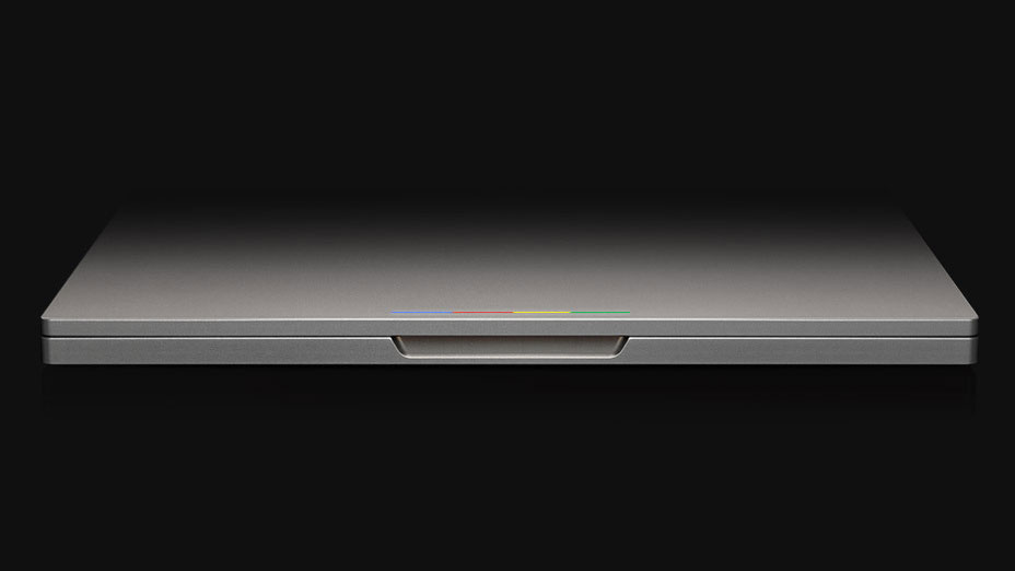
The first time you see the updated Chromebook Pixel, you’ll probably wonder if Google changed anything on the machine. On the outside, it looks almost exactly like the old one, with its understated aluminum housing and thin LED lightbar at the top of the lid.
pixel_up_top
There are a few very small differences compared to the first version: The color of the metal housing is now a bit lighter, and the bottom of the laptop is kept off the ground with two lines of rubber at the front and back instead of four small nubs. But that’s it.
“We wanted to remain very honest to what we are trying to achieve,” Andrew Bowers, Google’s director of consumer hardware, told me when I asked him why Google decided to mostly stick with the original design. And that’s fair enough. Even today, the Pixel’s design looks pretty up-to-date and nobody is going to confuse it with a MacBook Air (it’s also too thick for that, though it’s now maybe a millimeter thinner than the original).
When you open the Pixel, you also won’t see any major changes, either. It still features the same good — and in my view slightly improved — keyboard, as well as the same beautiful (but also highly reflective) high-density 2560 x 1700 12.95-inch touchscreen display with a pixel density of 239 ppi (that’s a total of 4.3 million pixels).
It’s the inside of the Pixel that has been completely revamped. It now features a far more powerful 5th-generation Intel i5 processor. On Google’s Octane benchmark, the base model of the new Pixel scored 24,392 points compared to 21711 I got on the old one.
In daily usage, you probably won’t immediately notice this faster processor, but what you will notice is that the laptop remains cool at all times. The old Pixel would heat up pretty quickly under even the lightest load and the rather loud fans would kick in to cool it down. The new Pixel now has two fans, but I still haven’t been able to get them to kick in during normal usage.
Unlike Google’s earliest attempt at making its own Chromebook back in 2010, the Pixel still features a very responsive touchpad, too (and there’s no silliness around “Force Touch” here either).

Battery life and USB Type-C charging

Also improved is the Pixel’s battery life. While the old one would die after about five hours, Google claims the new one will run for about 12 hours. I haven’t quite been able to match that in the week I spent with the device, but I have been able to get about 10 hours of work done before I had to plug it in. Thanks to that, you could easily get through a full workday with the new Pixel and get in an hour or two of couch browsing.
Chromebook_Pixel_TypeC_MacroTo get to this kind of battery life, Google employed a couple of interesting strategies. The screen now uses content-adoptive backlight, for example, and it features a relatively new technology called panel self-refresh, which allows the GPU to save a bit of power when there isn’t a lot of fast-moving content on the screen. The keyboard backlight, too, will dim when you don’t use it for more than 30 seconds and then automatically turns on again when you start typing.
You could easily get through a full workday with the new Pixel and still get in an hour or two of couch browsing.
The new Pixel now features a nifty fast-charging mode. With this, you can get about two hours of battery life out of a 15-minute charge. So when you are sitting at the airport and your Pixel is about to run out of juice because you forgot to charge at home, you can still get a decent amount of power into the battery before you board your plane (assuming you can find power, of course…). Charging the whole laptop takes about an hour-and-a-half.
The most interesting thing is how you charge, though. The Pixel now uses reversible USB Type-C ports on the left and right of the device, making this the first Chromebook — and of the first laptops in general — to support this next-gen version of USB.
Apple made a big deal about the new Type-C ports on its new Macbook earlier this week. But this is obviously an industry standard that many companies worked on, including Google, and it’s nice to see the industry come together to support this instead of the proprietary solutions that have dominated the laptop world for too long.

“I think the real innovation that debuting here is the idea of universal charging,” Bowers told me. Nobody wants to carry around half a dozen different types of chargers every day, after all. Google’s product manager for the Pixel Adam Rodriguez also noted that now that most phones have standardized on micro-USB chargers (except for our friends at Apple, of course), it’s time something similar happened for laptops, too. USB Type-C can provide up to 100W of power. That’s enough for a high-end laptop, and because there are a lot of smarts in this system, the charger can easily step down to provide power to smartphones, too.
Google is getting the details right here.
Type-C, of course, isn’t just about charging. It can also support displays and other peripherals through connectors. Google itself is launching a couple of these, including Type-C to USB, HDM and DisplayPort adapters. And because this is Google, the company is open-sourcing the hardware schematics of its adapters. Google provided us with a range of USB and display adapters for Display Port and HDMI. Suffice to say, they worked as promised. Google will charge $12.99 for its Type-C to the standard USB A plug cable and adapters. Adapters for HDMI and DisplayPort will cost $39.99.
pixel-keyboard

Touch screen

Just like the first Pixel, the new one also features a touch-enabled, high-resolution display. There are no major changes here, but Google says it has the new screen shows more vibrant colors thanks to an improved sRGB color gamut.
I’ve used the original Pixel quite a bit, but I never really found the touch screen to be a major selling point. It works as expected, but I never really found myself drawn to it except for occasionally scrolling down a long page when I’m sitting on the couch. Maybe this will change, though, now that Google is bringing more Android apps to Chrome OS.
Chrome OS is starting to feel more like a fully featured operating system.
The one thing I don’t like about the screen is how reflective it is. In many situations, you can deal with that by bringing up the screen brightness (though you sacrifice battery life then), but this isn’t a laptop you want to work on outside when the sun is shining.
What I am a big fan of, however, is that Google stuck to its guns and kept the 3:2 aspect ratio. While 16:9 or 16:10 is pretty much the standard now, I much prefer having a higher screen over a wider one. There is still enough screen real estate for those who want to do so, especially if you turn up the display resolution to a still very usable 1600 x 1062. At the maximum native resolution of 2560 x 1700, things get a little bit small for my eyes.

Lightbar

The lightbar on the lid of the Pixel is still its most distinct design element, but with this update, Google has also brought some functionality to it. When the lid is closed, you can now tap on the laptop and the lightbar will show you the current battery level. It’s a small feature, but it shows that Google is getting the details right here. Unlike in the previous version, the lightbar now also stays illuminated while you’re using the laptop.

Still the best Chromebook money can buy

If Chrome OS feels limited, you can always run Ubuntu on it and get all the benefits of the hardware without the limitations of Chrome OS. Thanks to Google’s recent updates, though, Chrome OS is starting to feel more like a fully featured operating system — even when you’re not online. You still have to content with the limited hard disk space, but for many developers — who are the target market for this machine —  disk space is less of an issue than processor power and battery life.
Google will be the first to admit that a high-end Chromebook has limited market appeal. Just like with the old Pixel, it’s probably best to judge it for what it is: a great ChromeBook and a price that (now) seems pretty fair for the hardware quality you get.

SteamOS Hits Major Milestone

Steam now boasts more than 1,000 gaming titles for Linux, and therefore, SteamOS. Everything from indie games to AAA titles are available from the service. Best yet, even more titles are regularly popping up, with 14 games launching this week alone.
Steam launched its Linux efforts in early 2013 with just 50 games and took a year to hit 500 titles. Now the game count is at 1004 and climbs to 1835 if downloadable content like DLCs and expansion packs are included.
Linux has never been considered a gaming platform. In its early days the open source operating system was simply too fragmented for developers to keep up. Then Valve came along and announced that its Steam platform would support Linux.
Valve announced SteamOS seven months after launching Linux titles on Steam. This was Valve’s answer to gaming consoles. Yet it faced a major hurdle in that it was based on Linux and therefore the breadth of the games available on Steam wouldn’t be playable.
That was two years ago and SteamOS is still alive albeit only one of Valve’s living room solutions. Announced earlier this month, Steam Link promises to allow gamers the ability to stream PC games to a Chromecast-like device. The gaming company also announced a VR solution that gathered accolades at a recent gaming conference.
As Valve keeps developing SteamOS, more computer makers are jumping on board. Several new SteamOS machines were unveiled several weeks ago. And at the clip compatible games are becoming available, buyers will have plenty of options when the machines ship later this year. 

This USB Drive Can Nuke A Computer

x407ca7d45e.jpg.pagespeed.ic.Uc_AVgIQHLDo not ever use a random USB flash drive. There are plenty of software exploits that can ruin your computer or life. And with this flash drive, it can physically destroy your computer by blasting a load of voltage to the USB controller with negative voltage. Think Wile E. Coyote and an ACME Human Cannon. BOOM!
.
Put simply, the bits inside the USB drive draws and stores a ton of power. When a certain level is hit, it returns the power to the source, which is either a dedicated USB controller or the CPU itself. This is bad news bears. The amount of power returned overloads the circuits, rendering it useless. Since a lot of USB controllers are built directly into the main processor… bye bye computer.
Scary. Thankfully the creator hasn’t released the schematic for the drive.
There are enough USB exploits floating around to warrant caution. Some will unknowingly install malware or backdoor software, and now, there is at least one, that will actually destroy your computer. It’s straight out of Colin Farrell spy movie and a fantastic argument for Apple’s vision of the future. 

Latest OS X Beta Includes Support For Force Click And Pressure Sensitivity For Drawing Apps

Apple’s latest beta for developers for OS X 10.10.3 adds some new tools that will be available to third-party software developers targeting owners of the upcoming 12-inch MacBook and the new 13-inch Retina MacBook Pro. These include support for new Force Click secondary pressure-based input, support for accelerator features that translate amount of pressure into subtle changes in the speed of functions like fast forward in media applications, and add pressure sensitivity for drawing and graphics software.
The new tools also include a new drag-and-drop mechanism, whereby developers can use a Force Click deeper press to trigger the launch of an automatic destination for a selected piece of content. Apple already showed how Force Click can be used in its own applications and across the OS to do things like open up Wikipedia articles related to words in any field of text, but it seems like developers will be able to make use of these tools to have Force Click trigger the functions that are most relevant to the app at hand, on a software-specific basis.
Apple’s support for pressure sensitivity, with specific mention of drawing and creative software, is one thing that struck me as particularly interesting in my early experience with the new Mac trackpads. Apple says in its release notes for this beta that devs can specifically use the pressure sensitive to adjust line weight depending on how hard a user is pressing, so with either a pen input or a finger it seems like this could act as a small-scale, but powerful drawing tablet in a pinch.
Other cool potential features: scrubbing video at variable speed depending on how soft or hard you tap. There’s also lots of potential for gaming, too, so it’ll be very interesting to see what kind of things third parties do with these new capabilities. 

Apple Expediting The Future Is No Betrayal

Apple Expediting The Future Is No BetrayalApple’s new MacBook, which limits input and output to a single USB-C port and a simple 3.5mm audio in/out jack, has been characterized by some as a move that’s antagonistic to the consumer. Critics point to the single port, as well as the performance limitations inherent in using an Intel Core M chipset for power management and fanless logic board design, as causes for complaint, and in some cases as causes for nearly inchoate rage.
But in truth, the new MacBook is nothing short of the future, delivered ahead of schedule and without exorbitant cost, with a bright neon “OPTIONAL” sign flashing overhead.
The new MacBook is an engineering showcase, inside and out, top to bottom. That doesn’t mean it’s the best computer available in Apple’s lineup for any given consumer: It is designed for a specific audience, and it’s designed to anticipate the growth of that audience in the years to come. In many ways, Apple’s new MacBook will appeal to the same crowd that is just fine using an iPad as their primary computer, and judging by the cumulative success of the iPad since its introduction, as well as the general trend of the PC industry, that’s a good bet to make.

The 12-inch MacBook isn’t even occupying an exclusive price point among Apple’s notebook lineup. You can get the current MacBook Air starting lower and ranging through that $1,300 zone and well beyond, with updated internals also debuted at Monday’s event. If the $1,299 MacBook were the only game in town for someone looking for a portable Apple OS X computer in that price range, and if it offered the port loadout it does in today’s computing and computer accessory environment, then some of these complaints might be valid – but it isn’t, and they’re not.In other words, that Core M processor isn’t hiding – Apple isn’t claiming this computer is a powerhouse media-editing tool. Instead, it’s a fast, light, everyday machine. It’s a gazelle, not a rhino. If you want a rhino, Apple has plenty of those, too – the new 13-inch Retina MacBook Pro with Force Touch is a prime example.
As someone who has actually touched, held and used the new MacBook, I can personally attest to the fact that this is a fully realized piece of equipment, and one that offers significant advantages in exchange for its perceived trade-offs. As with any purchase decision, prospective buyers will have to weigh the device’s particular strengths and weaknesses against their own usage habits; something which, again, hardly merits ire.
Apple’s main strength when it comes to product design is being able to intelligently adopt new technology both early and late, depending on when it thinks it will provide the most value to users. Some things like NFC come after they’ve been out and available for a while, but in time for mass adoption in specific settings, and other features like Touch ID and Thunderbolt leave competitors scrambling to catch up. The USB-C shift is like those latter examples, a push forward that is part-and-parcel of the reduction of ports that accompany its introduction.

Behold my beloved 12-inch G4 PowerBook: Witness the many ports it provides. The left side of the machine is like the cratered surface of the moon, and the right side is dominated by an optical disc drive (it also weighs more than twice as much as the new MacBook, and it has a fan: boy does it ever have a fan). And yet today most people couldn’t even name each of those ports, let alone find a worthwhile way to use them.
The ultimate test for the new MacBook, as with any product Apple brings to market, will be in how it satisfies the needs of its everyday users. A lot of people have theorized that the notebook might not be able to handle some tasks like photo editing that even more casual computer users would need, but a lot of that is conjecture based on artificial tests on the Core M that spit out numbers about how the processor behaves on paper in a vacuum. Intel’s Turbo Boost tech doesn’t necessarily play nicely with these kinds of benchmarking tools, and virtualized testing is never a good substitute for real-world use.
The all-new MacBook represents a paradigm shift in personal computing, but Apple isn’t dragging anyone kicking and screaming into the future. I suspect, however, that those who do accept the fast-forward invitation ultimately won’t be all that troubled by the trade-offs it represents. 

Tim Cook offered Steve Jobs part of his liver; Jobs wanted to buy Yahoo, reveals new book

Tim Cook offered Steve Jobs part of his liver; Jobs wanted to buy Yahoo, reveals new bookA new book titled Becoming Steve Jobs by Brent Schlender and Rick Tetzeli claims that the current CEO Tim Cook offered Apple founder and then CEO Steve Jobs a part of his liver in 2009, when the latter was waiting for a transplant.
According to a report in the Telegraph the book says that in 2009, Cook went to see Jobs at his home who had “developed ascites – an accumulation of fluid in the abdomen,” while he waited for a liver transplant.
The report adds that “Cook was convinced Jobs was going to die and went to a hospital for tests to see if he shared his friend’s rare blood type.” It was a match and then Cook told Jobs that “there was no risk involved in the operation.”
Steve Jobs however wasn’t so happy and instead shouted down Cook saying he wouldn’t let him go through the procedure. Jobs eventually got a liver transplant later that year. He died in 2011 when his pancreatic cancer returned.
Recently Tim Cook told CNBC’s Jim Kramer that not a day goes by when he doesn’t think of Steve Jobs. According to Business Insider Cook said, “You know, there’s not a day that goes by that I don’t think about Steve. And – he is still the – core part of Apple. His DNA is deep in the company. And – his office is still next to mine, with his name on the door.”
According to a report on CultofMac, which looked at a preview version of the book on Amazon, the book also “reveals how Steve Jobs and Disney boss Bob Iger talked about buying Yahoo! together at one point.”
The report also adds that Jony Ive, Apple’s chief designer reportedly said that Apple will never make a television again. Steve Jobs died on 5 October 2011, just a day after Apple had announced its new iPhone 4s in the market.
The book is available for pre-order on Amazon and will start shipping on 8 April 2015 for India users.

Xiaomi Redmi 2 first look: Comes with a faster processor, new OS and at Rs 6,999 will be a hit

Xiaomi Redmi 2 first look: Comes with a faster processor, new OS and at Rs 6,999 will be a hit   Xiaomi has followed up its Mi4 launch in India, with the introduction of the new Redmi 2 smartphone.
The company, which entered the Indian smartphone market only in 2014 and that too with nearly year-old products, has managed to carve a space for itself in the Indian market, with a serious fan following. A testament to this fact is that, according to IDC, Xiaomi is now number five in the Indian smartphone market in Q4 of 2014 with a 4 percent market share
Redmi 2 is Xiaomi’s successor to its earlier budget smartphone, the Redmi 1S. The biggest changes in this smartphone from the earlier version are: design, 4G connectivity and a faster processor.
The Redmi 2 will follow the flash sale model on Flipkart (registrations start today at 6 pm) and it will go on sale on 24 March. Xiaomi says that 30-40,000 units will go on sale and it is hoping to move the Redmi 2 to a regular sale model that won’t require registration any longer.

We spent some time with the Redmi 2 at the launch and here’s our first look at the smartphone.
Design, Screen: Xiaomi has kept the screen size the same as the first Redmi device at 4.7-inches. It has a 1280x720p screen resolution along with an AGC Dragontrail Glass which makes the screen shatter and scratch-proof. It’s also laminated, which the company claims will help with viewing angles and reducing glare.
The design of the Redmi 2 is definitely in sharp contrast to the Redmi 1S which had less rounded corners. The Redmi 2 with its colourful options (although India is only getting White and Grey) and rounded corners reminded us of the iPhone 5c with a bigger screen. The back cover of the Redmi has a matte finish, quite smooth to the touch and without the glossiness we saw in the Redmi 1S. Personally we prefer the matte finish, which gives the phone a superior look.  The Redmi 2 is only 133 g, which makes it around 15g lighter than the Redmi 1S.

Given that Xiaomi hasn’t changed the price for the phone at all, and improved the design, the Redmi 2 looks like a steal.
Processor, Storage, Connectivity: The device has a Snapdragon 410 quad-core 64-bit processor with Cortex A53 CPU. The processor is clocked at 1.2GHz and the GPU is Adreno 306. The Redmi 1S had a Snapdragon 200 32-bit quad-core processor with Adreno 305 GPU.
It’s a fairly responsive phone, although we can comment more strongly on this only after we spend more time with the review unit. The Redmi 2 also comes with 8GB storage space which can be expanded via MicroSD to 32GB and 1GB RAM, which might be disappointing for some users. The Redmi 2 also supports USB On The Go (UOTG) and will allow users to connect other USB peripherals like keyboard, game-pad, etc, which sounds quite interesting.

This is a 4G smartphone, with both SIM slots supporting 4G and it supports both LTE bands in India (FDD and TDD) which is great news for users who want to try out 4G and don’t want to spend a lot of money on such a device. Other connectivity options include WiFi, Bluetooth, GPS.
Camera, Battery: The device has a 2 megapixel front camera for selfies and an 8 megapixel rear camera with a LED flash, a Beautify feature (essentially Xiaomi’s own version of filters, which fixes a photo based on gender, lighting, age etc) and Cloud Camera roll, where all your photos are stored on the Mi cloud should you opt in.

The Camera is one of the strongest features of the Redmi smartphone and from what we saw in the demo units, the pictures were sharp and crisp. Especially given the Rs 6,999 price tag, this is definitely one of the better cameras around in its price range.
The battery is slightly more powerful than the Redmi 1S at 2200 mAh, and is removable. The Redmi 1S had 2000 mAh battery and according to Xiaomi, the Redmi 2 has 10 percent more battery than Redmi 1S and supports Quick charge, which means 20 percent faster charging that the Redmi 1S.
In our review of the Redmi 1S, we had noted that “it took over 3 hours for us to go from 10 to 100, but once it was fully charged, we could easily use the phone for over 14 hours on the single charge.” Hopefully Redmi 2 will charge faster as Xiaomi has promised. Of course we’ll be able to discuss this more assertively once when we’ve spend some time with the device.

OS and other features: Redmi 2’s biggest standout feature is its MIUI 6 OS which runs on top of Android KitKat. Key features of the MIUI 6 are: Motion, Colour Content, Customisation and Security. If you are one of those users who want every little detail of his/her phone customised, the MIUI 6 is meant for that. It’s an entirely different Android experience.


MIUI 6 allows floating notifications, where if you get a call you don’t have to leave the app to attend to the call. There’s also a division of Notifications on the basis of important and unimportant ones and users can choose which apps go on which side of the line. Users can also choose certain notifications that they would like to see in the Locked Screen mode as well.
Users can also decide which apps get access to Data and WiFi and set the privacy settings for each app as well. There’s also bulk delete and move where you can remove more than one app at one time. For a Xiaomi smartphone, this is the USP and if you don’t want plain vanilla Android, this is a good option.
Conclusion: Xiaomi has been providing great specs at a low price and by keeping the price of the Redmi 2 at Rs 6999 the company is continuing to do just that. The smartphone definitely makes the Moto E (2nd gen) seem expensive and will compete with the Lenovo A6000 (another budget 4G smartphone which is priced Rs 6999). Given how Xiaomi has managed to build its brand in India, it’s likely that Redmi 2 will be a successful device. 

Google’s new browsing feature prevents unwanted software from changing your browser settings


Google’s new browsing feature prevents unwanted software from changing your browser settings Get ready to see more red warning signs online as Google adds ammunition to its technological artillery for targeting devious schemes lurking on websites.
The latest weapon is aimed at websites riddled with “unwanted software” a term that Google uses to describe secretly installed programs that can change a browser’s settings without a user’s permission. Those revisions can unleash a siege of aggravating ads or redirect a browser’s users to search engines or other sites that they didn’t intend to visit.
Google had already deployed the warning system to alert users of its Chrome browser that they were about to enter a site distributing unwanted software. The Mountain View, California, company just recently began to feed the security information into a broader “safe browsing” application that also works in Apple’s Safari and Mozilla’s Firefox browsers.
All told, the safe browsing application protects about 1.1 billion browser users, according to a Thursday blog post that Google Inc. timed to coincide with the 26th anniversary of the date when Tim Berners-Lee is widely credited for inventing the World Wide Web.
Microsoft’s Internet Explorer doesn’t tap into Google’s free safe browsing application. Instead, Explorer depends on a similar warning system, the SmartScreen Filter.
Google’s alerts about unwanted software build upon the warnings that the safe browsing system has already been delivering for years about sites infected with malware, programs carrying viruses and other sinister coding, and phishing sites that try to dupe people into sharing passwords or credit card information.
Whenever a potential threat is detected by the safe browsing system, it displays a red warning sign advising a user to stay away. Google also is demoting the nettlesome sites in the rankings of its dominant Internet search engine so people are less likely to come across them in the first place. Google disclosed Thursday that the safe browsing application has been generating about 5 million warnings a day, a number likely to rise now that unwanted software is now part of the detection system.
As it is, Google says it discovers more than 50,000 malware—infected sites and more than 90,000 phishing sites per month.
The safe browsing application had gotten so effective at flagging malware and phishing that shysters are increasingly creating unwanted software in an attempt to hoodwink people, said Stephan Somogyi, Google’s product manager of safe browsing.
“The folks trying to make a buck off people are having to come up with new stuff and that puts us in a position where we have to innovate to keep pace with these guys,” Mr. Somogyi said in an interview. “You are now going to see a crescendo in our enforcement on sites that meet our standard of having unwanted software.”

Motorola Moto E (Gen 2): First Impressions

Motorola on Tuesday launched the new 3G-capable Moto E in India, called theMotorola Moto E (Gen 2), at Rs. 6,999. The smartphone was first unveiled last month. A 4G LTE variant dubbed the Motorola Moto E (Gen 2) LTE, which was unveiled at the same time, will be launched in India later, said Motorola at its event in Delhi.
Up front, the smartphone boasts of a 4.5-inch qHD (540x960-pixel) display, which is a slight increase in size compared to the original Moto E's 4.3-inch qHD (540x960-pixel) display. In the little time spent with the device, we found that the screen brightness was a little too low for outdoor usage under direct sunlight, but apart from that it seemed fairly decent.
The display is protected by Corning Gorilla Glass 3. It has an anti-smudge coating, but we still found it to be a fingerprint magnet. The non-removable rear of the device has a matte finish, so at least that does not attract too many smudges.
(Also seeMotorola Moto E (Gen 2) vs Motorola Moto E)Overall, the Moto E (Gen 2) seems to have borrowed its design from the Moto X, except for the front speakers which were present in the original Moto E. To make this phone look a little more interesting, Motorola has used interchangeable Motorola Bands (essentially, removable sides) on the Moto E, which neither the Moto X nor the Moto G have. Each smartphone ships a body-coloured band (Black or White), and users can purchase additional bands (Golden Yellow, Turquoise, Blue, Raspberry, Purple, Red) which are priced at Rs. 999 for a pack of three. There are also Motorola Grip Shells (Golden Yellow, Charcoal, Turquoise, Blue, Raspberry), which cost Rs. 999 each.
Coming to the performance of the device, the Motorola Moto E (Gen 2) packs a quad-core 1.2GHz Qualcomm Snapdragon 200 SoC with integrated Adreno 302 graphics, coupled with 1GB of RAM. In our limited time with the device, we found to our surprise that it performed quite well. With Android 5.0.2 Lollipop out-of-the-box, the Motorola Moto E (Gen 2) seems like a worthy competitor to the likes of popular models from Xiaomi and Lenovo in this price band. We will have more detailed observations about the device's specifications and performance very soon, so stay tuned.
The Motorola Moto E (Gen 2) packs a 5-megapixel rear camera and a VGA (0.3-megapixel) front camera. Neither camera looks good in terms of specifications, but the images taken with them are of average quality. Outdoor shots taken with the rear camera as well as indoor shots in good lighting conditions appeared quite decent to us, (see sample image). We are not betting a lot on the cameras, but we will test them thoroughly in our formal review, which is coming up soon.
To enhance the user experience Motorola has added a small trick to the camera app. With two flicks of the wrist, the device switches between its front and back cameras. Motorola calls this "Quick Capture".
Another feature of the Moto E that might come in handy for some people is that the time and notifications can be seen in black and white on the locked screen, when you pull the device out of a pocket.
Overall, the new Moto E (Gen 2) seems to be a decent budget device, compared to its current competitors. We will test the device thoroughly when we conduct our full review.

Samsung Galaxy Xcover 3 Rugged Android Smartphone Goes Official

samsung_galaxy_xcover3.jpgSamsung's new rugged smartphone named Galaxy Xcover 3 has quietly gone official. The handset is expected to be showcased at the CeBIT trade show scheduled between March 16 and 20 in Germany.
Sammy Hub claims that the Samsung Galaxy Xcover 3 will be launched at a price of EUR 275 (approximately Rs. 18,000) and will be available to buy starting April.
The highlight of the Galaxy Xcover 3 is it meets US MIL-STD 810G requirements for surviving adverse temperature, humidity, rain and altitude conditions. It is also dustproof, shock- and water-resistant with IP67 certification and can survive being dipped in up to 1 metre water for up to 30 minutes with covers slightly closed.
Samsung Galaxy Xcover 3, much like other rugged Galaxy smartphones, features physical buttons for home, multi-tasking, and back button. It also comes with an "Xcover key" that turns on the flashlight while a double tap on it opens the camera app.
For specifications, the new rugged smartphone features a 4.5-inch WVGA (480x800 pixels resolution) display which is quite low considering the price tag it is expected to come with. The Samsung Galaxy Xcover 3 runs Android 4.4 KitKat; though it is upgradeable to Android 5.0 Lollipop.
It is powered by a 1.2GHz quad-core processor (unspecified chipset) coupled with 1.5GB of RAM. There is 8GB of inbuilt storage that is further expandable via microSD card. A 5-megapixel rear camera with support for underwater shooting mode and a 2-megapixel front camera are also onboard the Samsung Galaxy Xcover 3.
The Galaxy Xcover 3 supports LTE, GPS, Bluetooth, Wi-Fi, NFC, and Micro-USB connectivity options. Sammy Hub notes that smartphone also includes Samsung Knox suite of mobile enterprise security solutions. It measures 9.95mm thick and weighs 154 grams. The handset is backed by a 2200mAh battery.

Vu 50-inch UHD 3D Smart LED TV Review: High-End Features at a Surprising Price

Vu_50in_Main_ndtv.jpgVu (pronounced 'view', in case you didn't know) may claim to be an American company and even has a registered office there, but in fact it is as Indian as Indian gets. That isn't necessarily a bad thing, because Vu has slowly been making a name for itself as one of the leading Indian display manufacturers. Since launching in 2006, Vu has maintained a solid presence in the Indian market, regularly launching feature-packed televisions that seriously undercut competitors on pricing. The company is also aggressively trying to promote the idea of selling televisions online, in the process breaking every unspoken rule of Indian retail. Whether that will work is anyone's guess, but the Vu LEDN50K310X3D, a 50-inch 3D UHD TV with smart functionality that costs Rs. 90,000, is as good a deal as any.
You can't help but be amazed by the perceived value of this TV. A similar model from Sony of the same size and with the same feature set retails at nearly twice the price. The question we must ask is what exactly are you trading for the benefit of paying that much less? And more importantly, can you really do without those bits?
Design and Features
Most TVs are black, except for the occasional shiny silver finishes that Samsung and LG like to try out on their high-end models. However, the back and sides of the Vu LEDN50K310X3D are white. This is an unusual colour choice and doesn't match the black panel at all. This shouldn't matter too much because none of it is visible head-on. The bezel is also slim, with nearly the entire front occupied by the panel itself.
The stand is a simple affair with sturdy parts. It took us all of five minutes to assemble it and get the TV into position. The box does include wall-mounting equipment if you prefer your TV up on a wall.
The Vu LEDN50K310X3D isn't quite as slim as we'd like, considering that Samsung and LG have managed to produce TVs that put today's thinnest smartphones to shame. However, at this price, we can't be fussy about everything. 
Connectivity options on the Vu include a total of four HDMI ports and three USB ports. Two of each are conveniently located near the top left corner, which is great if you often plug in a pen drive or a portable device. On one side, you'll find an audio-out port for headphones and a DVB-T/C tuner input. Along the bottom are the other two HDMI ports, the third USB port, an Ethernet port for a wired Internet connection, a VGA port with a 3.5mm audio input, an optical audio input, and a set of RCA terminals for composite and component AV. The HDMI 2 port supports MHL connectivity, which will be useful if you have a compatible smartphone. 
While we don't really expect TV remotes to be beautiful and tough as steel, we still expect them to be somewhat sturdy and simple to use. Vu's remote is anything but that. It feels cheap, and the buttons have an unpleasant click when pressed. The four-way pad in the middle wobbled violently even when we simply ran a finger over it. Overall, we came away with the impression that this remote won't last too long without a lot of care.
The smart interface of the TV could have been better too. Again, we aren't looking for an out-of-the-ordinary experience from the interface, since the point is to get you to your content quickly and get out of the way. Unfortunately, the UI is slow and clunky, with response times of two to three seconds when a selection is made. Loading screens lagged too much for our liking, and left us slightly irritated. Even once you have content running, accessing settings is a cumbersome task. The clunky interface makes it hard to pause, rewind and fast-forward media quickly. This brings us back to the remote, which should have had dedicated buttons for these controls.
Picture Performance
We used several types of content to properly review the Vu LEDN50K310X3D. This included a variety of standard definition and 720p TV shows and video clips, a 1080p 2D version of Edge of Tomorrow, a 1080p 3D version of X-Men: Days of Future Past, and a demo 4K clip of stock footage. We also ran a few YouTube videos at different resolutions to see how performance was while streaming media over the Internet.
Picture quality varied between good and satisfactory, depending on the content that was being played. There was some motion issues; we noticed significant judder when the TV was put through heavy action scenes. This reduces when the scene switches to something calm and slow, becoming bearable, and in most cases unnoticeable.
There are also occasional colour issues. Bright scenes don't suffer quite as much, but darker, duller scenes are washed out and feel unsatisfactory. Tweaking the colour settings can change that temporarily, but this won't remain consistent. A new scene may lead to the colours being overdone and require you to change the settings again. And above all, black levels are below average, appearing more of a dark shade of grey. This interfered considerably with the overall picture.
Upscaling lower-resolution content to use all of those pixels is something the TV does fairly well. Most standard definition and 720p content played smoothly and picture quality was free of outwardly evident flaws. Native full-HD and 4K content looked far better, of course. Still, we have seen better 4K performance from Samsung and LG, at least in terms of motion and colour reproduction.
We were looking forward to trying out the TV with 3D, and it didn't disappoint. Although the Vu LEDN50K310X3D uses active 3D, the flickering of the glasses was surprisingly light and the experience didn't cause as much fatigue as we're used to with active 3D. There is a real sense of depth and dimension to the 3D picture. Raindrops and shattering glass felt so real, our reflexes kicked in more often than we would care to admit. It's a beautiful 3D picture, provided you're watching the right kind of content.
Sound Performance
Audio output from the Vu 50-inch LED isn't bad in any way, but it isn't particularly good either. We weren't expecting much from a pair of speakers that are way too small to do a great job, but we still found ourselves a bit disappointed with the way they sounded at times. Volume is on the low side, and you might find yourself turning it up nearly all the way to the top just to get decent enough output.
There's also a bit of drone with the low frequencies. Certain low notes have a tendency to boom and roar through the room, which almost feels like distortion. Apart from these two complaints, though, sound is decent enough. It's also important to ensure the back of this TV isn't too close to a wall or cabinet, as this will cause problem with audio delivery. Correct positioning solved most of our problems.
Verdict
The Vu LEDN50K310X3D 50-inch UHD 3D Smart LED TV is a bit of a mixed bag when it comes to performance. It has its strengths and flaws, and there were times when it delighted us and then got on our nerves in the span of a few seconds. There's also the matter of how long it will last, which we cannot say for certain.
There's no denying that this is still excellent value. You'd be hard-pressed to find another 50-inch TV with so many features at this low a price. Whether you'll actually put all the features to use is a completely subjective matter. For one thing, there's still a desperate lack of Ultra HD content, and for another, 3D movie watching is usually limited to the movie theater. Smart functions aren't all that interesting either. But there's a definite shift in viewing preferences, and hopefully we won't be kept waiting for UHD content much longer.
If you think you'll make full use of these futuristic functions now or in the near future, it might be worth bearing with the shortcomings and investing in a low-cost TV such as this one. And even if you don't, you're assured a big-screen experience for much less than what the Japanese and Korean brands charge. We'll conditionally recommend the Vu LEDN50K310X3D 50-inch UHD 3D Smart LED TV for the above reasons.
Price (MRP): Rs. 90,000
Pros
  • Comprehensive feature list
  • Superb value
  • Excellent depth and quality with 3D
  • Decent performance with UHD video
  • Conveniently located ports
Cons
  • Sound performance could be better
  • Colours feel dull and washed out at times
  • Poor remote and user interface
Ratings (Out of 5)
  • Design: 3
  • Performance: 3
  • Value for money: 5
  • Overall: 3.5